Life gets busy and before you know it your house can be two decades outdated! Between raising kids, work, sports, homework, and then the daily dash to prep dinner—time moves quickly and sometimes styles do too.
That was the experience of our recent clients who were eager to refresh their 90s home with more cohesive flooring, updated furnishings, and lighter tones for a brighter feel overall. Our favorite part of the whole transformation of course was how happy it made our clients to see the final reveal, and hearing them call their well-loved home their “new” house!
This design project involved updating the foyer, staircase, living room, dining room and powder bathroom. Highlights included:
Scandinavian Style
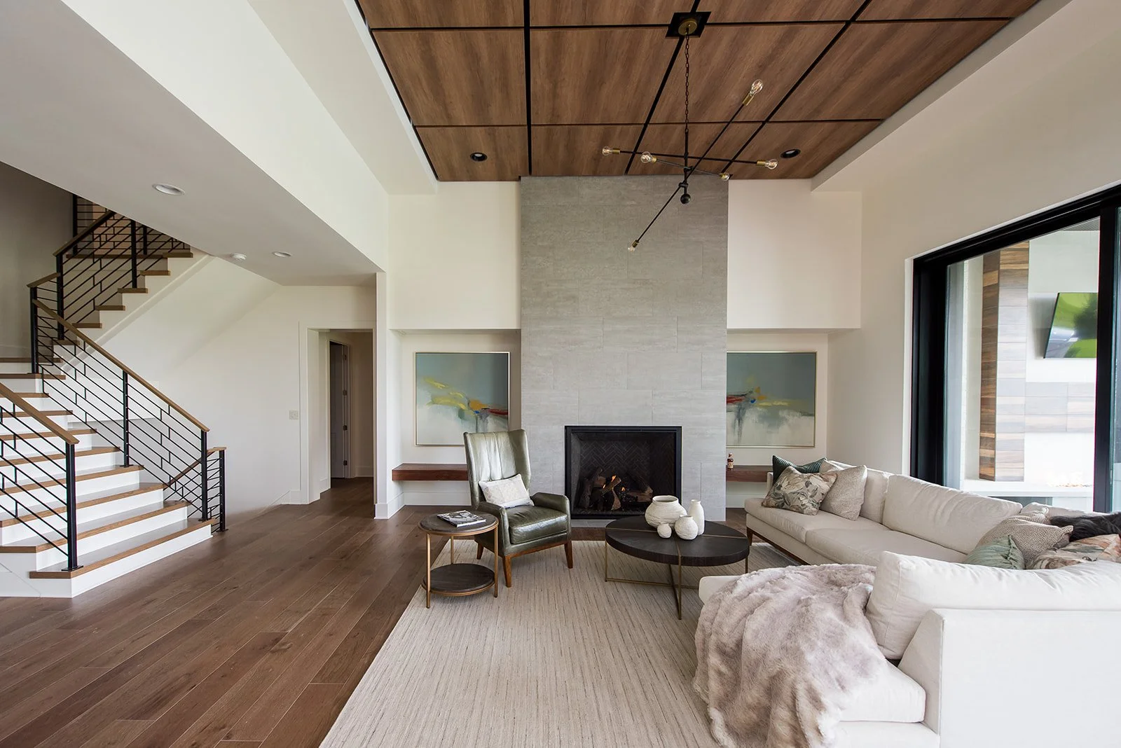
With an emphasis on minimalist Scandinavian style, light paint colors were used like Sherwin William’s “Crushed Ice” throughout the space. Other design elements included wood ceiling beams, black accents, rich leathers, crisp lines, minimal decor, light wood tones, and a cozy sofa.
Gallery Art Wall
Challenged with finding a way to display our clients eclectic art collection, we came up with a unique gallery wall installation to spotlight their favorite pieces from around the world—they purchase a new piece of art on each trip they take! By creating a large wall grid in the living room, there is plenty of space for their collection to grow.
Cohesive Flooring
One big goal for our clients was to simplify flooring throughout the main level for a cohesive look. We achieved this by using a Luxury Vinyl Plank (LVP) product throughout the first floor design. LVP fit family durability and budgetary needs. Light blonde wood tones were selected to instantly modernized this home.
Redirected Flow
Couch seating, which was once pushed up against the wall, was pulled out to float in the room and create a more walkable flow. The television was moved from a wall location to above the fireplace to open up additional options for furniture layout.
Bold Beams
There was an existing structural beam in the great room that was covered in plaster. To update the look and create symmetry, the existing beam was covered with a 3-sided wood wrapped beam and stained to match the new tones. A second beam was then added to balance the design.
Door Dilemma
No room to open the door? No problem! With the foyer lacking room for doors to fully open off the sitting room, we added a bypass barn-style door as a creative solution. Not only is this feature functional, it’s eye-catching too!
Powder Room Pop
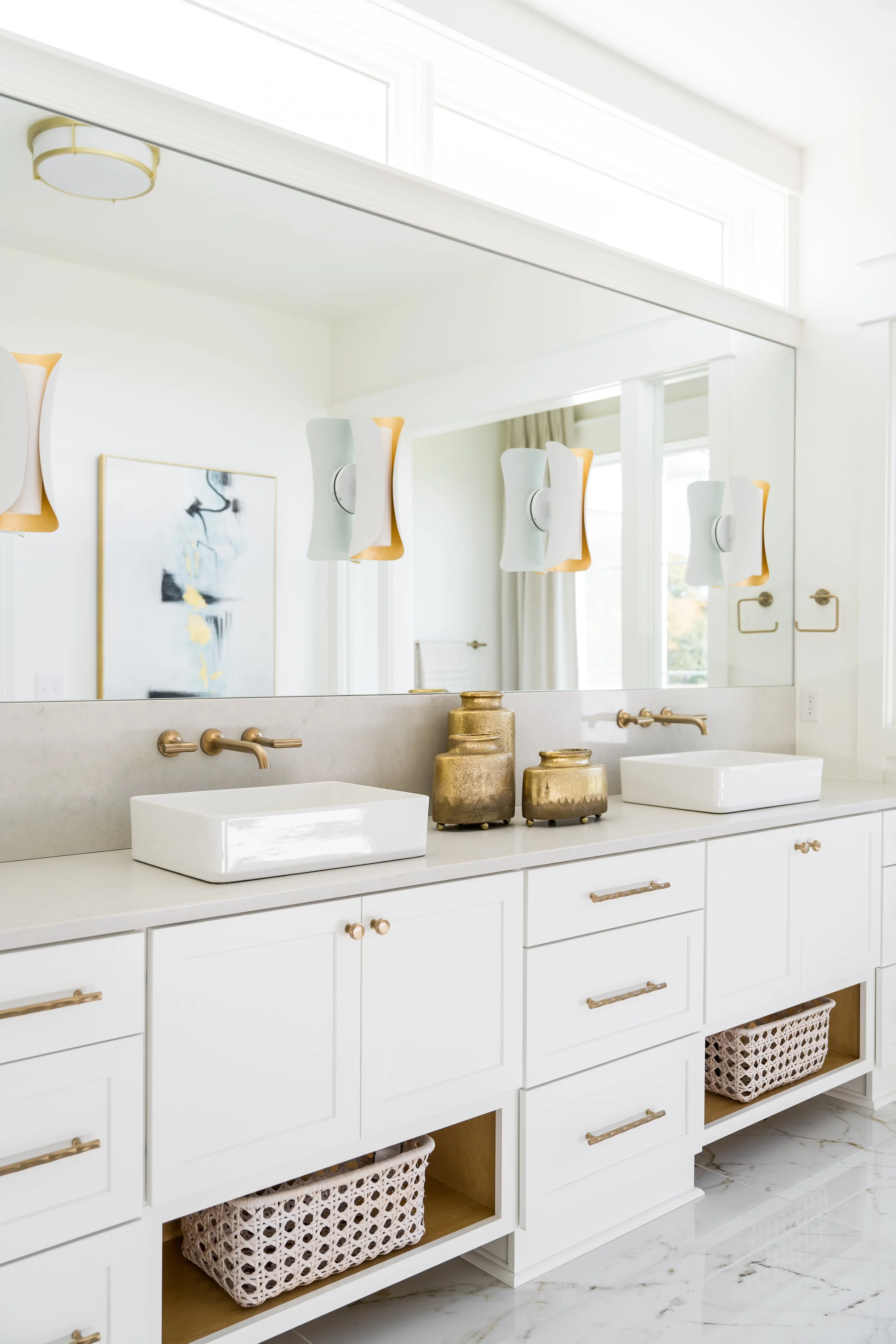
Half baths are the perfect place to add a pop of pattern to a room. Small enough to risk a busy design, and a hot spot for visitors to take it in. We used the powder room as an opportunity to have some fun with an abstract wall design.
Dramatic Drapery
We added height to our design by taking the beautiful two-toned window treatments up to the second window in the living room. Bold patterned drapery was also hung high in the adjoining dining room to further elevate the space.
Furnishing Fav
Picking a favorite furnishing is never easy for a designer, but there is no denying we fell hard for one particular piece, the sideboard! A parquet-like black beech pattern complements whitewashed beech and natural oak doors. Linear iron legs bring a modern touch to this one-of-a-kind retro inspired sideboard.
Renovations have been full of surprises lately, due to supply chain issues. This project was unfortunately no different, but our clients were trusting, patient and flexible throughout the process. At times we needed to reselect items, but together we decided statement pieces (like their chandelier) were worth the wait. Having a designer to help you navigate and problem-solve these surprises helps keep the project moving seamlessly forward!
We would love to learn more about your house dreams, contact us to jumpstart a conversation about making your remodel a reality.
View more photos of this project here.
Happy Home, Happy Life